About
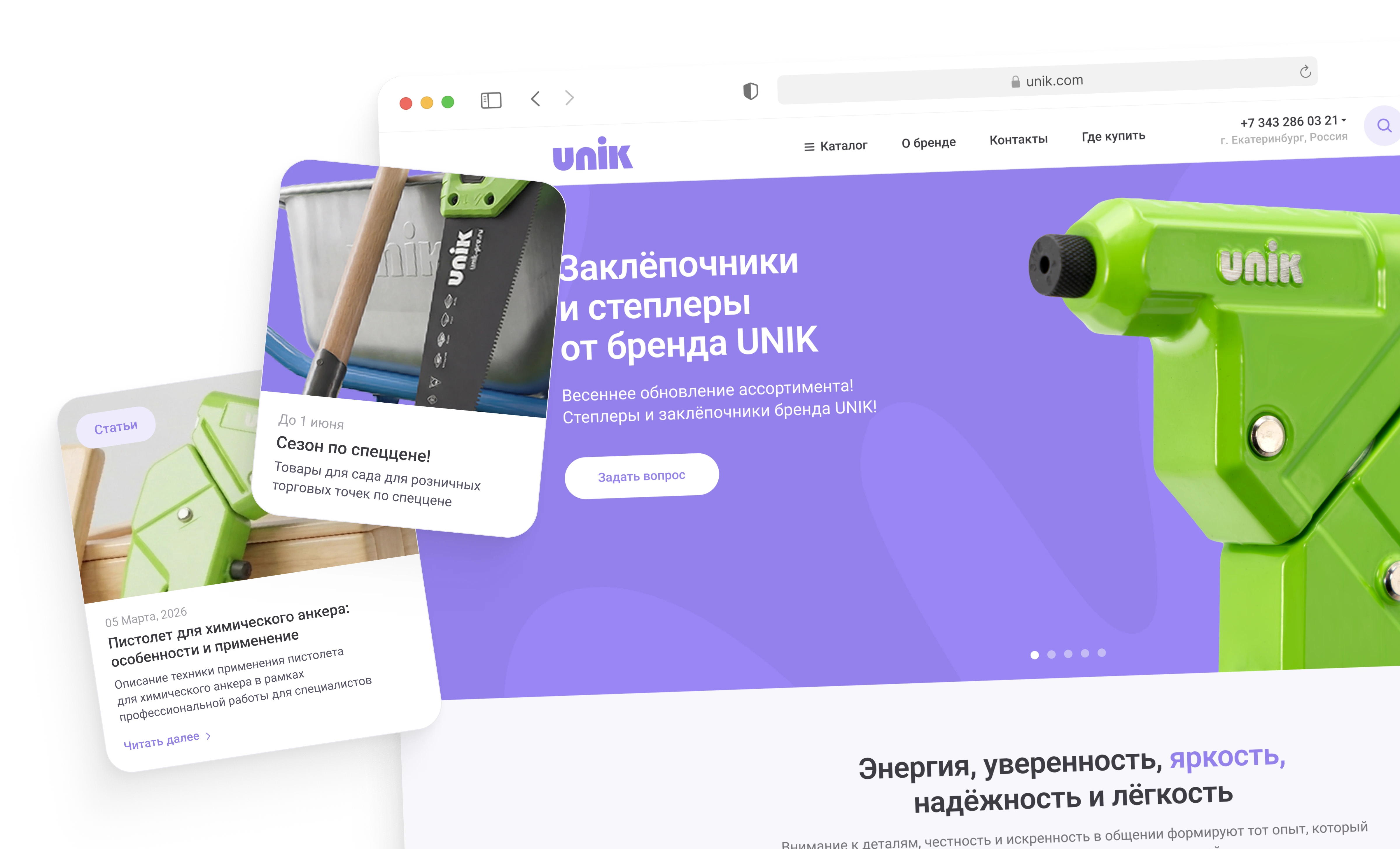
The existing website already contained an extensive catalog, product recommendations, brand information, articles and lead-generation forms. However, these sections competed for attention and did not form a clear visual or navigational system.
The redesign reorganized the existing content around two primary goals: help visitors understand the brand and help them find the right product.
Since the site was built on a specific platform, the new interface also had to maintain compatibility with the existing content structure and reusable site components.
Challenge
The website needed to work both as a brand platform and as a practical product catalog.
The main challenge was to balance expressive visual communication with a large amount of structured product information. The experience had to feel distinctive without making catalog navigation, product comparison or technical details harder to use.

Early stages of development
I reviewed the existing website, content structure and brand materials to identify the main directions for the redesign.
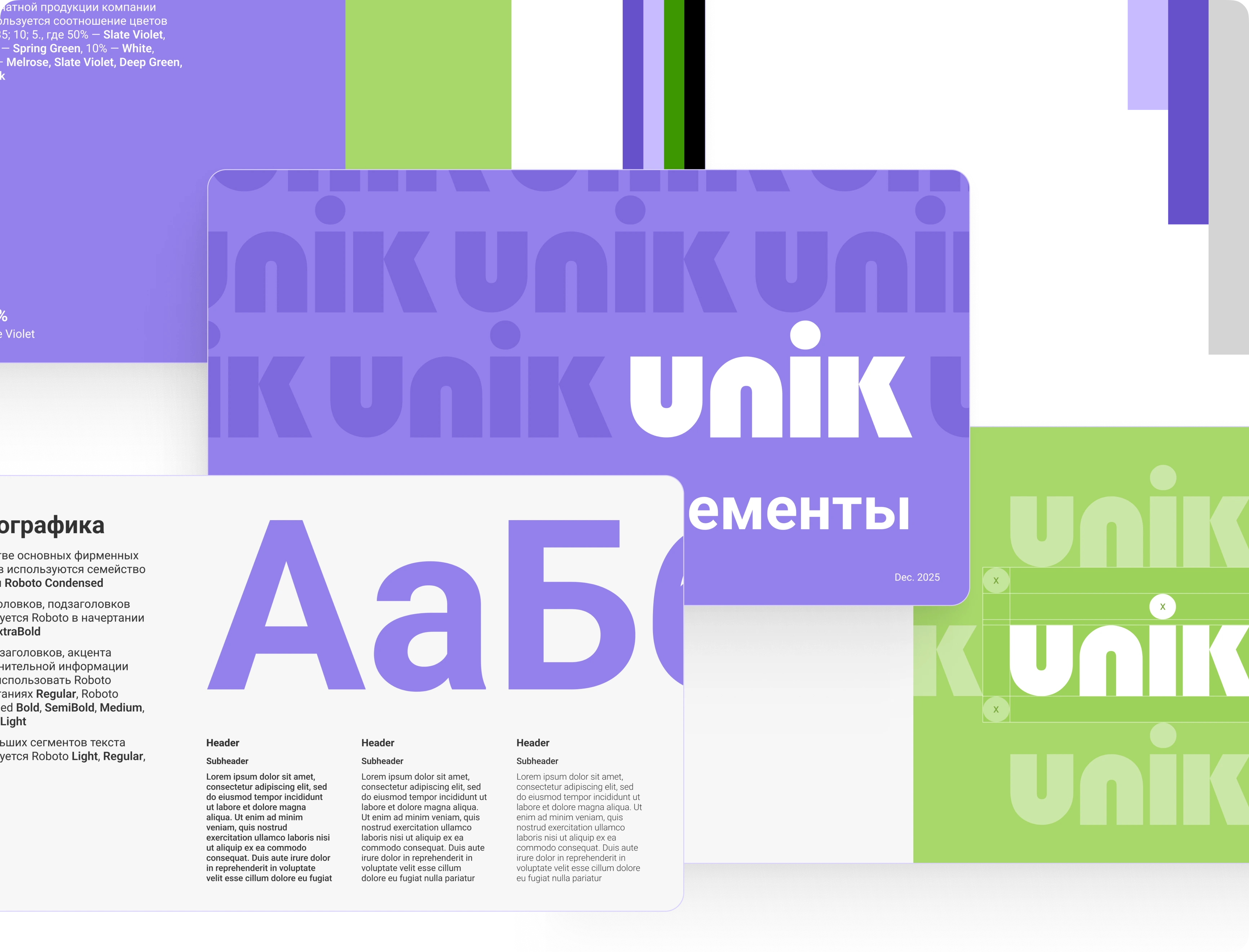
As part of this process, I consolidated the existing visual principles into a brand guideline covering logo usage, colors, typography, graphic elements, photography and digital applications.
This created a consistent foundation for the new website and future brand communications.
Brand experience and homepage
The homepage was redesigned as a sequence that gradually introduces the brand and leads visitors toward the catalog.
The opening screen combines a focused product message with expressive product imagery. Brand values, categories, popular products and supporting content are then presented as distinct sections with clear roles.
Lead-generation forms are integrated throughout the page for visitors who need help choosing a product or want to discuss purchasing conditions.

Product discovery
The catalog was reorganized around large visual categories, commonly searched items and popular products.
Inside a category, filters stay close to the product grid and use characteristics relevant to the selected tool type. Users can switch between grid and list views depending on how much information they need to compare.
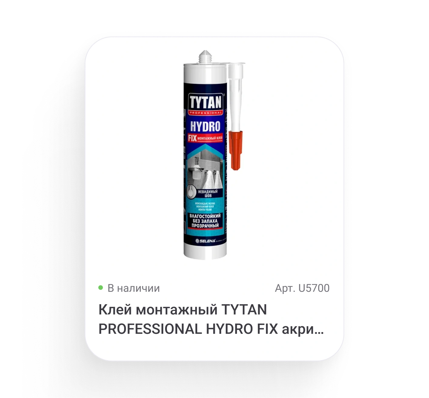
Consistent product cards surface the information required for the next decision: product image, availability, article number, name and a clear path to details.
Visual system
A distinctive color system, expressive product imagery and consistent graphic patterns make the brand recognizable across the entire website.
Visual categories, relevant filters and consistent product cards help users move from a general need to a specific tool.
Desktop and tablet layouts preserve the same priorities while adapting navigation, filters and content-heavy sections to the available space.
Result
The redesign transformed the website from a collection of catalog and marketing sections into a more consistent brand and product experience.
A clearer hierarchy, reusable components and a more structured catalog make the website easier to navigate while giving UNIK a stronger and more recognizable digital presence.
